|
Here we present several different plots of the spectrum of Fourier
amplitudes in GCP data. We look at both network variance (the Stouffer Z
calculation) and device variance (ordinary variance among the eggs).
The question is whether there is any indication of periodic structure in
the data. We wish to know, for example, if there is any diurnal
variation suggesting differences corresponding to time of day, or if
there are any longer term effects associated with the day or the week,
etc.
The short answer is that there is no structure to be seen from this analysis.
Here are some details.
Complications in the early data are avoided by ignoring 1998.
This doesn't cause problems because we are looking for
general persistent trends.
Three days of data were removed in Aug 2002 to make
the data commensurate over the period of one week.
(Four days, Aug 5-8, 2002, were removed because of technical defects.
Taking out 3 more allows the calendar week to synchronize over the whole
database). The continuous data (except for the week in Aug 2002) thus
extends from Jan. 1, 1999 to Sept. 7, 2004, and comprises 2,070 full days.
Raw and Smoothed Amplitudes
Fourier amplitudes are calculated for the time-ordered sample variances
of network Z-scores.
The same calculation is made also for the device variance measure and
for simulation data created by randomly reordering the data sequences.
The device variance is the time ordered sample variances of
normalized trial scores for 1 minute resolution.
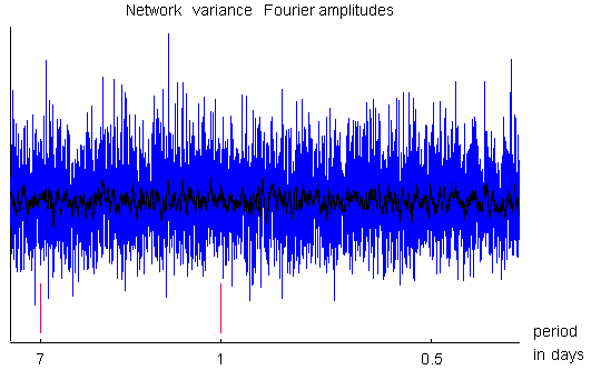
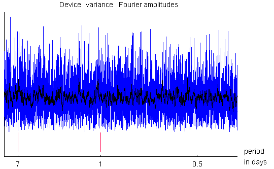
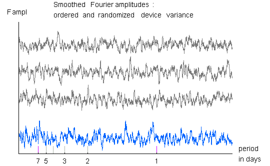
The two plots immediately below show the first 5000 amplitudes,
with the axis marked to indicate the amplitudes corresponding to
periods of 7, 1 and 0.5 days. A superimposed curve shows the plot
after smoothing over 20 consecutive amplitudes.
Various related analyses, such as autocorrelation, as well as
different smoothing windows, etc. have been explored, but none of these
efforts reveal any structure in the amplitudes.

Amplitudes of the Fourier transform of the network variance. The plot is consistent with a lack of periodicity in the data. Fourier amplitudes are calculated for the time-ordered sample variances of network Z-scores. The continuous data extends from Jan. 1, 1999 to Sept. 7, 2001. The plot shows the first 5000 amplitudes of the series. Marks on the horizontal axis indicate the amplitudes corresponding to periods of 7, 1 and 0.5 days, respectively. The bottom curve shows the plot after smoothing over 20 consecutive amplitudes. The red bars at 1 and 7 days are a guide for the eye.

Amplitudes of the Fourier transform of the Device variance.
The plot is consistent with a lack of periodicity in the data.
Comparison with Simulations

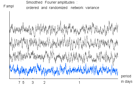
The blue curve shows the Fourier transform of the Network variance,
smoothed with a 20 amplitude window.
The three black curves show random permutations of the data sequence,
treated the same way. None of these plots show any indication of
structure, and in particular, the smoothed spectrum from the
simulation data and the real data are visually indistinguishable.

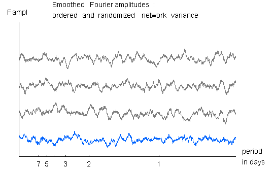
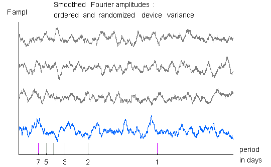
The blue curve shows the Fourier transform of the Network variance,
smoothed with a 60 amplitude window.
The three black curves show random permutations of the data sequence,
treated the same way. None of these plots show any indication of
structure, and in particular, the smoothed spectrum from the
simulation data and the real data are visually indistinguishable.

The blue curve shows the Fourier transform of the Device variance,
smoothed with a 20 amplitude window.
The three black curves show random permutations of the data sequence,
treated the same way. None of these plots show any indication of
structure, and in particular, the smoothed spectrum from the
simulation data and the real data are visually indistinguishable.

The blue curve shows the Fourier transform of the Device variance,
smoothed with a 60 amplitude window.
The three black curves show random permutations of the data sequence,
treated the same way. None of these plots show any indication of
structure, and in particular, the smoothed spectrum from the
simulation data and the real data are visually indistinguishable.
Cumulative Deviation of Spectrum

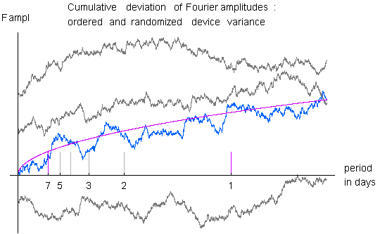
In this figure,
the Fourier spectrum of the device variance for the original and
the simulation data is smoothed, and the cumulative deviation from
expectation is plotted. This operation shows unbiased data as a random
walk, but any persistent excess deviation produces a slope in the curve.
In the case of the device variance spectrum, there is a slight bias to
positive deviations, The device variance is the time ordered sample
variances of normalized trial scores for 1 minute resolution. The
variance, of course, is chi-squared (or nearly so, to the accuracy of
calling the normalized trial scores normal random variables) but the
degrees of freedom increases with the number of trials in a minute
(i.e., increases with number of online regs). The variances are all
normalized to 1, but the variance of the variances increases with df.
Thus the device variance time series should be thought of as a series
drawn from a changing underlying distribution. As a consequence the fourier
components show a skew, can be seen in the plot - the values are
slightly more extended to the high side of expectation.
Examining Details for Special Periods
It is worthwhile to look more
carefully at the small peaks in the device variance amplitudes that are
near one day and one week. Since those are the periodicities we would
most expect, we wish to be sure we can consider
them as chance fluctuations, as seems to be the case.
If there were periodicity due to peoples' daily activity, then we could
expect that there would be a one hour offset each time they went on
and off DST. That is, the summer months would be offset with respect to the
winter months. This offset (a phase shift in Fourier terms) would
blur the long term coherence of a daily periodicity and reduce the intensity
of the fourier amplitude. To check this we examine the appropriate DST offset
at March 31 and October 31 (these are roughly when the dates of the DST
change. The offset should thus synchronize 95% of the data, with
some phase shift still occurring around the actual days and places it really
happened each year...). If there were a periodicity responsible for the
peaks near 1 day and 1 week and the periodicity depended on
people's activities according to their local clocks, then the weak
peaks should grow a bit when the DST phases were restored in this way.
Result: No change in these two weak peaks.
So this is an argument that the peaks are not coming from a
real, persistent periodicity in the device variance.
Another conceptually similar test looks at consecutive 2 and 3 year
segments of the 6-year data sequence. If there's
a daily periodicity, it should be present in these, although at lower
intensity.
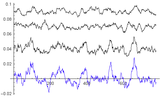
As the plot below shows, there is no evidence for such structure.

The black curves are fourier
amplitudes of the the first, second and third 690 day segments of the device
variance, going from bottom to top. The 1-day fourier amplitude is at 690 on
the horizontal scale. The blue trace is the fourier amps for the whole
2070-day device variance (scaled so that the 1-day ampl also falls at 690.)
The first segment looks much like the blue trace, but the
2nd and 3rd segs are quite different. We can conclude that
there are not periodicities throughout the device variance
time-series on the scale of days.
| 