Extended Analysis: September 11 2001 in Context


Note added in 2009: This page reports various exploratory analyses of the 9/11 data. Most were contributed in the months following the Sept. 11 attacks. In the ensuing years, we have developed a more sophisticated understanding of the GCP data, and the analyses below do not reflect all that we have learned. One important understanding is that the average effect size across all events is half a standard deviation or less. Thus, the experimental effect is in general too weak for reliable interpretation of individual events. From careful re-analysis we know that even in a strong case such as 9/11 the data are only marginally significant. It was a powerful event and the graphical displays in these pages seem impressive, but even so, the 9/11 results alone should not be taken as proof of a global consciousness effect -- that requires the patient accumulation of replications.

Some of the figures here are also in the briefer, primary page on the disaster in New York, Washington, and Pennsylvania. I want to leave the redundancy, because that is the simplest way to represent the development of the analysis and our understanding of the EGG response to the attacks. This context is a little bit of history, and is a reflection on the process of learning what is most interesting in a complex database. We are attempting to extract signal from noise, and we know that the ratio is very small. We know that the movements and variations in data from REG instruments used to study a possible consciousness field are mostly noise, and that any signal is always mixed with and masked by mere random activity.

Usually we deal with this by a simple procedure, namely by defining the statistical question prior to the analysis. This allows calculating a reliable probability that any apparent signal is after all, just chance fluctuation. We did make two clear predictions of this nature, and they are included in the formal results for the GCP. A third prediction was made by Dean Radin, but it was less specific that is required for full definition of the statistical analysis. It may be included in the formal database if we can accept it as a proper reflection of the hypothesis we are testing. Some of Dean's exploratory work is on this page, but he has consolidated the best examples, together with other work on time and distance in a comprehensive report. Beyond the issues of the formal scientific work, we wish to explore this extraordinary database quite freely, looking for especially powerful ways to visualize structure, that is, signals in the data. Here are the explorations.

On September 11, 2001, beginning at about 8:45 in the morning, a series of terrorist attacks destroyed the twin towers of the World Trade Center and severely damaged the Pentagon. The disaster is so great that in New York we have as yet, two days later, only guesses about how many thousands of people perished when the WTC towers collapsed. Commercial airliners were hijacked and flown directly into the three buildings. The first crashed into the North tower at 8:45, and about 18 minutes later the second airliner hit the South tower. At about 9:40, a third airliner crashed into the Pentagon. At about 9:58, the South tower collapsed, followed by the North tower at 10:28. At about that same time, the fourth plane crashed in Pennsylvania. We later learned from reports of cell phone calls that this was the result of heroic action by the passengers.

Cumulative Deviations

The main formal prediction for this event is essentially the same as that made for the terrorist bombing in Africa in August 1998. That specified a period beginning a few minutes before the bombing, and including an aftermath of "a few hours." The actual time was from 10 minutes before the bombing to three hours after. We use in this case 10 minutes before the first crash to four hours after, which makes the aftermath period roughly the same following the last of the major cataclysmic events. The measure we use is the Chi-square representing the magnitude of the departure of the eggs' data from theoretical expectation, which is accumulated over the time defined for the analysis.

The resulting graph of data from the formal prediction shows a fluctuating deviation during the moments of the five major events, as ever-increasing numbers of people around the world are watching and hearing the news in stunned disbelief. Times of the major events are marked by boxes on the line of zero deviation. The uncertain fluctuation of the EGG data continues for almost half an hour after the fall of the second WTC tower. Then, at about 11:00, the cumulative deviation takes on a powerful trend that continues through the aftermath period and ultimately exceeds the significance criterion, with a final probability of 0.035 (Chi-square is 15314 on 15000 degrees of freedom. The number of eggs at the time of this analysis was 36.) As we will see, this significant departure from expectation continues over many more hours.

terror010911z1.gif: 
Terrorist Attacks, September 11 2001

It is instructive to compare the graph of the same data, but plotted as the simple cumulative Z-score, which represents the sign of the deviations and not only their magnitude. In principle, this display could be completely different in its general appearance compared with that of the formal measure, which shows the accumulating absolute deviation. As we see in the following figure, there is considerable similarity. Again early in the period of disbelief and shock there is no strong trend, but at about the time of the collapse of the first tower, a powerful trend indicating high correlation among the eggs begins, and persists for two hours. For that period of time the slope of the line is extraordinary. If it were not selected by inspection, but had been an a priori prediction, its associated chance probability would be 0.000075; odds of less than 1 in 10000.

terror010911sz.gif:
Cumulative Z (not squared), September 11 2001

By the end of the day (midnight, GMT) 35 eggs had reported data, and the following figure looks at the full day in New York, beginning at midnight, Eastern daylight time, which corresponds to 04:00 GMT. The scale of hours in this graph indicates the time in New York, and the major events are marked on the zero line of expectation. The figure displays the cumulative deviation of the squared Z-scores (the cumulative deviation of Chisquare). It shows a continuous positive trend which culminates in a probablity of 0.024 for the 20 hour period. Corresponding pseudo-data computed for this day are included in the figure for comparison. The trend of the EGG dat begins well before the first attack, as early as 5 or 6 in the morning. It is noteworthy that the variance analysis, below, also shows a striking inflection a few hours before the attack.

Chisq, Terrorist Attacks, September 11 2001

Over the next days, we looked at longer periods of data to see the magnitude of the response of the EGG network to this tragic, horrifying event. These figures do not correspond to formal predictions, but are extensions of the formal method of analysis to look at the context and achieve a more general understanding. The next graph shows three days surrounding the attack. Statistically, this cumulative departure from random behavior is associated with a probability of 0.005 (261060 on 259200 df).

Context graph 1: 
Terrorist Attacks, September 11 2001

Next, a longer period of time surrounding September 11, with the attack marked and a small probability envelope for comparison to see the sharpness of the increase in non-random deviation. The slope of the graph beginning just before the attack to the end of the 13th is extreme. An estimate for the probability can be made, and lies between 0.003 and 0.0003.

Context graph 2:
Terrorist Attacks, September 11 2001

The strong slope has a clear trend, and begins with a distinct inflection at a point well before the attacks began. If we extrapolate the slope itself, it passes through the inflection at about 04:00 on the 11th, suggesting that the terrorist attacks might have already begun to register on the EGG network some four or five hours before the first World Trade Center tower was hit.

terrorslope.gif: 
Terrorist Attacks, September 11 2001

Odds Ratios and Smoothing

A valuable tool for explorations is smoothing, where a average is calculated within a window that is moved across the data sequence. This is typically used to see whether there may be a concentration similar values, or clusters of extremes. In the September 11 data there is some concentration of strong deviations around the major events, with a peak at 10:13 EDT. This first figure shows the raw odds against chance for the squared Stouffer Z-scores for each second of the day. The maximum Z-score is 4.81 and a Z this large would appear by chance one time in about two weeks of seconds.

Raw Z-score odds: Terrorist Attacks, September 11 2001

Dean Radin did an independent confirmation. This is his description of the procedure:

create a Stouffer Z across all eggs per second
create z-square from the Stouffer Z
consolidate 5 seconds worth of z-squares
create z-equivalent and associated odds graph of these 5-second chunks
no sliding window

Results essentially replicate your new odds chart. It is also the case, BTW, that the lowest NEGATIVE z is a mere ~4 minutes after the large positive spike.

(Note: the five short spikes of equal size indicate the times of the attacks.)

DIR confirmation of 
Z-score odds, raw: September 11 2001

For the next figure, the data are passed through a moving average using a smoothing window of one hour width, applied to the Z-scores before they are squared and converted to odds ratios. Here it appears that there is major structure beginning a short while after the first WTC tower was hit.

One sec (i.e, 
no smoothing) Chisquare odds: Terrorist Attacks, September 11 2001

A striking picture is generated when the smoothing is applied later in the computations directly to the odds ratios. The resulting picture is remarkable, but the details vary greatly if different window sizes are chosen. The impressive main peak is actually driven by the inclusion of the extreme score previously mentioned, because it dominates each average as the one-hour window moves over it.

One Hour
smoothing of chisquare odds: Terrorist Attacks, September 11 2001

Variance Analyses

For a broader perspective, the next set of analyses used a different measure. Instead of looking at the shift of the mean values of the REG devices, we ask whether the variability among the eggs changes. Is there an increase or decrease in the range of scores that may be correlated with the event of the attack? The procedure used for visualization is the same as before, but we plot the accumulated deviation of the variance across the 35 or 36 eggs from its expected value.

The first figure shows the cumulative deviation of the variance over the the 20 hours from midnight to 20:00. No probability calculation has been made for this figure, but it shows a normal fluctuation around the horizontal line of expectation until about 05:00, followed by a precipitous rise, indicating a great excess of variance continuing until about 11:00. Shortly after, a long period begins during which the data show an equally impressive deficit of variance. Again there is an indication that the effects registered for this horrendous event actually began to be noticeable several hours prior to the first attack. John Walker comments that the distinctive shape of the graph is suggestive of a classic "head and shoulders" graph seen in stock market analysis.

No probability calculation has been made for this figure, but the extreme excursion reaches a level of about three sigma, which corresponds to odds of about 1 in 1000. For a visual indication of the likelihood that this is merely a random fluctuation, the automatically generated pseudo-data for September 11 are plotted in the same format for comparison. In contrast to the real data, there are no long-sustained periods of strong deviation in the algorithmically generated data, although there is a small positive slope.

Terrorist Attacks, September 11 2001

Again, a larger context reinforces the impression that the variance measure is highly unusual around the time of the attacks. The following graph shows three days centered on the 11th, and shows the corresponding pseudo-data for comparison to the cumulative variance of the actual EGG data.

Terrorist Attacks, September
11 2001

A longer context is perhaps even more thought-provoking. Visually the next graph is striking in several respects. Because we do not have a priori expectations or permutation analysis to examine the likelihood of the trends, any interpretations we make are speculative. With that acknowledgement, we can note that the cumulative deviation trends suggest that the spike on the 11th was part of a buildup that began several days earlier, and took several days after the 11th to return to the level trends expected for random walks. The primary spike on the 11th is the most prominent in this context, but note that it is not unique; there are some other trends that, while not so sharp for so long, are also visually striking.

Variance, 12 day context, Sept 11 2001

Refining the Analyses, Dean Radin:

I have been continuing to analyze data from the Global Consciousness Project to confirm and then extend what Roger Nelson and I have found, associated with the events of 9-11.

For the technically inclined, the steps in creating the basic z-score plot were as follows:

0) download raw data from the GCP site (http://teilhard.global-mind.org)

1) calculate an empirical mean and sd for each GCP egg (i.e., RNG), over each day

2) calculate one z-score per egg, based on above mean and sd, per second, using daily empirical mean & sd

3) calculate sum of z-squares for all eggs in non-overlapping 5-minute periods, per day

4) keep track of number of degrees of freedom (same as # eggs reporting), for step 3

5) calculate chi-square for sum of z-squares for 6 hour sliding window, with right edge of sliding window at "present time"

6) calculate z-score equivalent for step 5

7) draw the plot

This graph shows results for a 6-hour sliding window, in terms of z scores, from Sept 6 - 13. In this graph, positive z's mean the RNGs became "more ordered" than expected by chance. Negative z's mean the RNGs became "more random" than expected by chance. The peak value in this graph is 9:10 AM, Sept 11. Between the beginning of the tragedy and 7 hours later this data shows a drop of 6.5 sigma (odds against chance of 29 billion to 1). Such large changes will eventually occur by chance, of course, but this particular change happened during an unprecedented event, suggesting that this "spike" and "rebound" were not coincidental.

Radin window_z.emp.jpg

This shows the one-tailed odds against chance associated with the above z-score plot, in log space. The peak is at 9:10 AM. The "0" in the x-axis shows the start of each day.

Radin odds.emp.jpg

This shows the two-tailed odds against chance associated with the above z-score plot, in log space. The first peak is at 9:10 AM, the second is at 4:20 PM. I show this to emphasize that unexpected negentropic and entropic changes both appeared during the crisis.

Radin odds2tail.emp.jpg

This shows the result for the z-score plot above when pseudorandom data are substitued for the real data.

Radin window_zp.emp.jpg

This shows the one-tailed odds ratio plot when pseudorandom data are substitued for the real data.

Radin oddsp.emp.jpg

This shows the two-tailed odds ratio plot when pseudorandom data are substitued for the real data.

Radin odds2tailp.emp.jpg

A draft report is now available giving the details of a sequence of analyses by Dean Radin examining the timing of significant spikes in the data and the effect of the distance of the eggs from New York and Washington.

More Context

The extraordinary results around the day of the disaster can be seen more clearly in the context of variations that are found in earlier data. Here is a picture of a month of data, from July 15 to Sept 16 odds against chance, using empirical mean and sd. The highest peak is at 9:10 AM 9-11.

Radin win715-916.emp.jpg

In the process of exploratory analysis, various parameters such as the width of the sliding window for the moving average. In some respects, the process is one of seeking an optimal algorithm for extracting signal from noise. This leads to some combinations that may be unusually successful, and although the analytical results have to be understood in context, we think it is worthwhile to show some of these special cases. Dean's accompanying remarks for the next figure were simply: "odds for 9/6 - 9/16, wow" The figure shows the one-tailed odds ratio for the 11 day period centered on 11 September. I was checking descriptions and technical information and asked whether I had correctly expanded the rather brief explanation of the figure. Dean responded, "I said wow because it was the first graph I did where Sept 11 was in the middle of the graph, and the spike just sits there all by itself, mocking us in our ignorance of what it means (I know we have some speculations, but sometimes I think we're more like a couple of clever neurons trying to figure out what the nature of a brain is)."

Radin sept6-16.emp.jpg

Premonition and Prayer

Just an hour and a half before these terrible events transpired, I had sent one of the occasional updates to my mailing list of people interested in the Global Consciousness Project. In it, I said that it had been rather quiet for the last couple of months, and ventured that this might be a good sign. Quoting from a followup note,

It is a terrible irony that I should have sent a GCP note with such an optimistic impression just an hour before the first explosive crash of the terrorist attacks in New York. Before the end of this day, I want to say how deeply saddened I am that this global event occurred, and I pray it will not lead to more events born of hatred and evil intent.

Please join us all in that prayer.

Since the horrible event, innumerable calls for prayer have been made. On the 14th of September there was a special emphasis on such collective spiritual moments, including major organized periods of silence in Europe and America. Doug Mast made a specific and formal prediction for a deviation of the Chisquare "over the time periods 1000 to 1003 GMT, corresponding to a European organized mourning (http://www.cnn.com/2001/WORLD/europe/09/14/europe.mourning/) and the time period 1200 to 1203 EDT (1600 to 1603 GMT) corresponding to the beginning of the Washington service and many organized mourning events in the Eastern US." Here is the resulting graph.

Doug Mast Pred: 
Silent Prayer, September 14 2001

The result is very interesting, I think -- a marginally significant *decrease* in variance. The Chisquare is 150.68 on 180 degrees of freedom, with probability 0.9455. The trend is steadily opposite to the usual (and specified) direction, but I think it somehow looks right -- symbolic of the moment's contrast to the preceding days. It may be worth noting that this is one of only two cases in the database of 80 formal GCP predictions where the result goes in the opposite direction.

Heroism

There were four planes taken by the terrorists. Only three made it to their destructive destinations. The fourth was apparently brought down to crash in western Pennsylvania by passengers who attacked and overcame the terrorists, in a deliberate sacrifice of their own lives. We did not make a formal prediction about this event, but it certainly deserves analysis from the point of view of the EGG network. We do not have precise timing information, so the times selected for analysis here are speculative and selected with emphasis on the dramatic trends.

The first of the two following figures shows the data during what was likely the buildup and the struggle. The spike at the end is driven by a one-second trial during which the eggs were so highly correlated as to produce a Z-score of 4.8, which has odds of less than 1 in a million. Such an extreme score might happen by chance once in 15 days; the odds of ocurring during the 1.5 hour span of the terror attacks is about 1 in 200.. The second figure shows 15 minutes immediately preceding the crash. We will never know whether this picture reflects anything of what was happening in reality, but I like to imagine it represents an acceptance of the sacrifice.

Informal graph: 
heroes flight 93, September 11 2001

Informal graph: 
heroes flight 93, September 11 2001

Statistics Notes

What is the difference in the Chisquare and Variance graphs. How does one change the "deviation" calculation to arrive at "variance"?

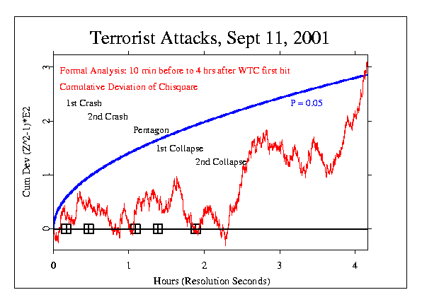
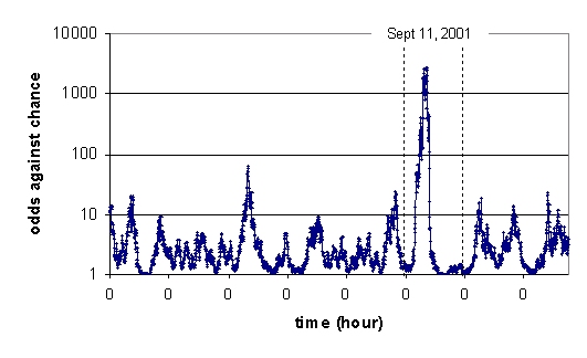
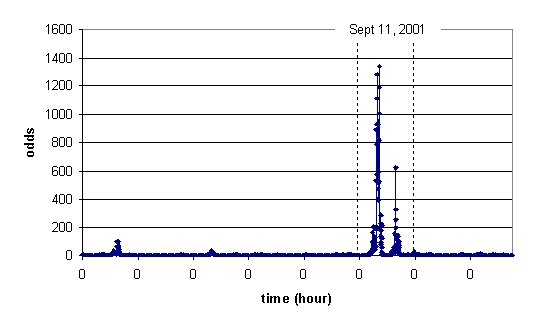
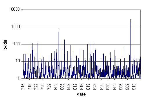
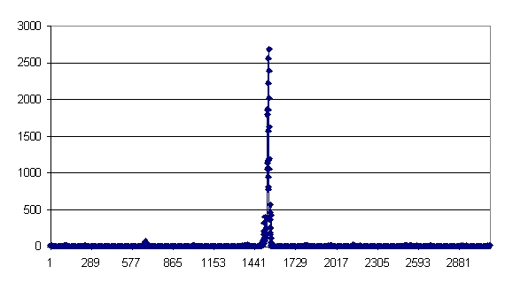
The Chisquare figures show the cumulative deviation of the second-by-second Z-scores (squared), compounded across the N eggs (N=36 to 38 at this time). That is, for each second, the Z's for all the N eggs are added and normalized by sqrt(N), then the resulting Z is squared to yield a Chisquare with 1 df, and finally the Chisquares-1 (Chisq=1 is the expectation) are cumulatively summed, to represent the departure from expectation.

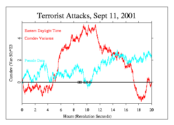
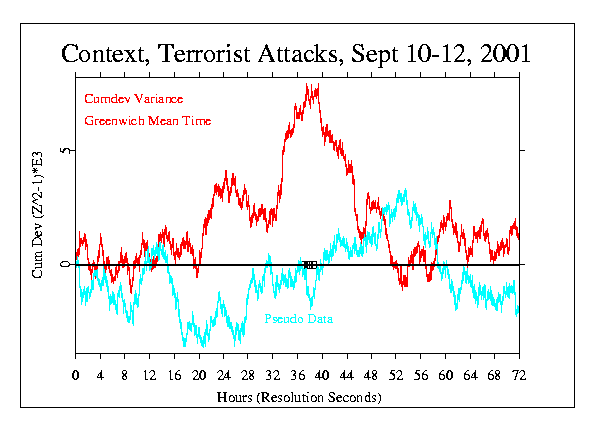
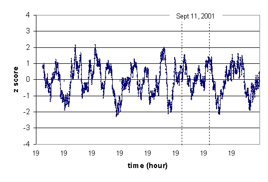
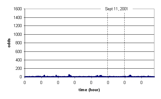
The Variance figures show something similar, but instead of the compounded Z across eggs, the variance (squared standard deviation) is computed across the N eggs for each second. The sequence of Variance-50 (Var=50 is the expectation) is then cumulatively summed as before.

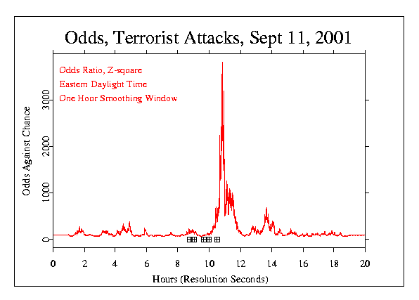
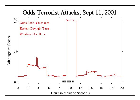
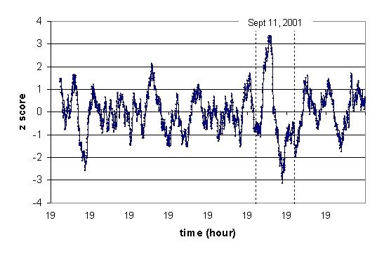
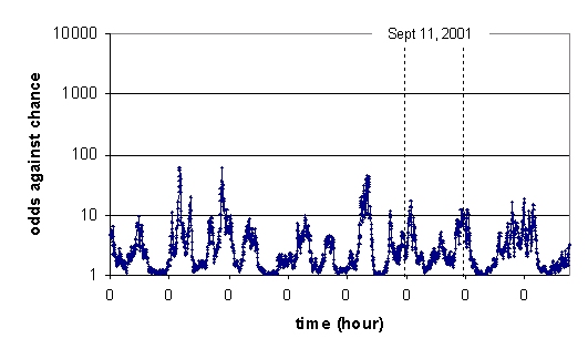
The Chisquare figure displays extreme departures, in either direction, of the trial scores of the egg from what is expected by chance. The Variance figure displays the degree of variability among the trial scores for the eggs. Chisquare addresses movement of the central value of the distribution, Variance represents changes in the range or width of the distribution.

What is the difference in the the analyses by Roger Nelson and Dean Radin?

The most important difference is in the treatment of the data at the finest scale. Neither way is superior, but there is a difference in what is expected or hypothesized about the behavior of the eggs in the presence of a possible influence. The two perspectives are complementary, and though they are not fully independent, using both contributes to our confidence that the apparent effects are not accidents or mistakes.

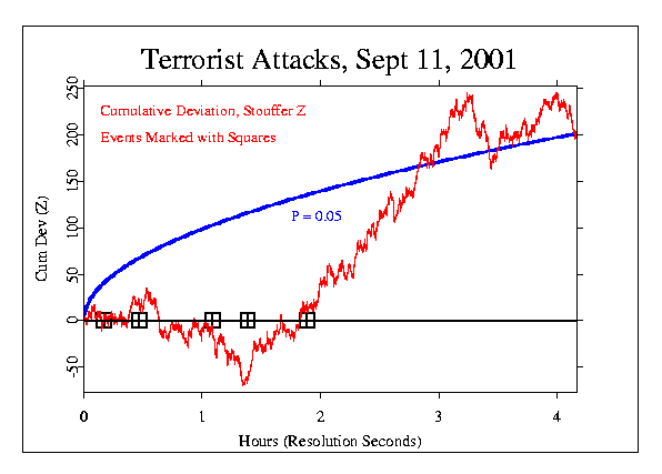
For each second, Roger calculates what is called a Stouffer Z across the eggs as described above. This means that in order to produce a large deviation, the eggs have to have a positive correlation ­ to be doing the same thing. This composite Z is squared, so it does not matter whether the average value is shifted to the high or low direction, but there must be some excess deviation and there must be a tendency toward inter-egg consistency in the direction of deviation. The result is a single squared Z-score, which is Chi-square distributed, for each second.

Dean calculates a Z-score for each egg separately, and squares these individual Z-scores. He then sums the squared Z's across the eggs, producing a a single Chi-square for each second. In this case, the eggs are not expected to show a positive correlation, and a high score requires only that there is a tendency for excess deviation in either direction; no inter-egg consistency in the direction of deviation is predicted. Again, the result is a single squared Z-score, which is Chi-square distributed, for each second.


GCP Home